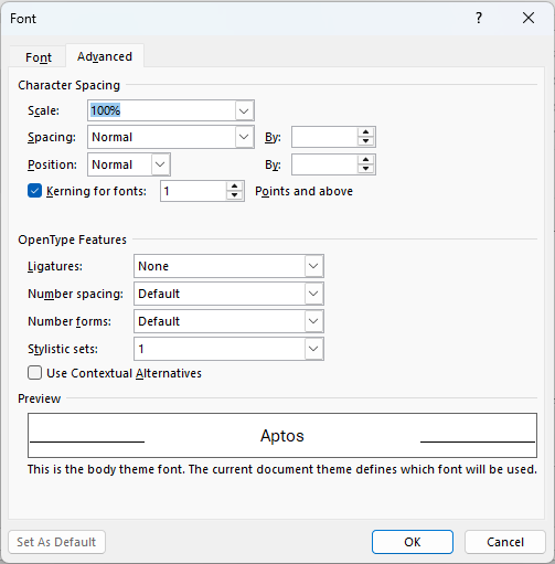
| Scale |
Adjust the width of characters, values range from 1% up to 600%, default is 100% E.g. 200% is twice as wide |
| Spacing |
Controlling the space between the characters. Options include:
- Normal: for default spacing.
- Expanded: adds space between characters (can specify in points).
- Condensed: reduces space between characters (can specify in points).
|
|
| Position |
Moves text vertically relative to the baseline. This is something you'd use potentially for footnotes, annotations, or math/scientific formatting or perhaps designing with logos and custom layouts.
- Normal: Default position.
- Raised: Moves text up (can specify in points).
- Lowered: Moves text down (can specify in points).
|
| Kerning |
Adjusts spacing between certain pairs of characters to improve readability (A–V, A–W, T–o, L–T, Y–A). You can enable Kerning and also set the minimum font size for it to be applied. Why a minimum font? Because at small sizes (e.g. 10 pt body text), you can't really tell the difference, but at larger sizes in headings, titles or logos poor kerning is very noticeable and looks awkward. |
| Ligatures |
In typography, ligatures are combinations of two or more letters joined together to make a single glyph. An example of a ligature is æ, which merges 'a' and 'e'. Ligatures are disabled by default in Word, mostly for simplicity and performance reasons since a lot of fonts don't support advanced OpenType features.
Word offers the following ligature options:
- None: No ligatures applied to the style.
- Standard Only: Combines common letter pairs into single glyphs (e.g., “fi”, “fl”).
- Standard and Contextual: Includes standard ligatures plus contextual ligatures that adjust based on surrounding characters for a smoother flow.
- Historical and Discretionary: Historical ligatures reflect classical typography, while discretionary ligatures add a decorative flair.
|
| Number Spacing |
Controls how numerals are spaced and aligned. There are 3 choices:
- Default: Uses the font’s built-in number style.
- Proportional: Each number takes up only as much space as it needs which makes it look more natural in paragraph body text (e.g., 1 is narrower than 8).
- Tabular: All numbers occupy the same horizontal space, best suited for vertically aligning digits for tables, spreadsheets, or financial data.
|
| Number Forms |
These are about two numeral styles used in typography:
- Default: Uses the font’s built-in number form.
- Lining: All numbers are the same height and align with uppercase letters. They also vertically align suiting tables, charts, and financial documents.
- Old-style: Numbers vary in height and alignment, similar to lowercase letters. Some digits descend below the baseline which is better for paragraph body text.
|
| Stylistic Sets |
Stylistic Sets offer alternate versions of characters, however most default fonts in Word offer little to no visible change with stylistic sets so these sets are not much worth bothering with. The tooltip is showing one example you can try: set '1' for the font EB Garamond.
Fonts that offer more Stylistic Sets but won't be preinstalled are Adobe fonts like Bickham Script Pro and Minion Pro or Google fonts like Source Serif Pro and Crimson Text. The bottom line is that stylisitc sets are really more for design-focused apps like Adobe Illustrator which allow you more control over them. |
| Contextual Alternatives |
Check box to switch on automatic adjustment of characters based on surrounding letters, particularly in cursive, calligraphic or decorative fonts. They’re designed to look more natural and fluid. E.g. the letter 'g' might switch to a different tail depending on whether it’s followed by a 'y' or a space.
|